Style guide
Direction on content, copywriting, imagery and formatting.
Good alternative guides are GOV.UK and the Guardian
Abbreviations
Avoid these unless they are in common use (etc, mph, Mr, Mrs, PS, Dr, Prof).
Don't add full stops between letters or at the end of the abbreviation (etc not etc.; PS not P.S.; Dr not Dr.; Prof not Prof.)
[see also Names and titles]
Acronyms
Avoid these unless they are in common use (NHS, BBC, DNA).
But if spelling out words and repeating them is cumbersome, in the first instance, spell out, then put the acronym within brackets, follow on by use of the acronym thereafter (the Independent Carrara Marble Extraction Co-operative (ICMEC) … though ICMEC warned supplies were dwindling).
Doing this means that readers should understand what the unfamiliar 'ICMEC' stands for when it appears subsequently.
However, if the organisation is referred to just once, use of an acronym is unnecessary.
Use capitals if the abbreviated version is said aloud using individual letters (NHS, BBC, DNA).
When the acronym is said aloud as a 'word', use an initial capital with the rest in lower case (Nato, Nasa).
Such 'words' which have become part of common language should lose the initial capital (awol, pin number, pdf).
Don't add word spaces between letters (HIV not H I V)
Ampersand
The & symbol.
Avoid use of '&' unless it is part of a brand, company name or in common use (V&A, Marks & Spencer, P&O Ferries)
Capital letters
Also known as upper case [see Upper case and lower case].
Apart from their obvious use: starting a sentence, initial letter of a noun or spelling out an acronym, in too many other circumstances capital letters can be used excessively.
This often happens in titles, suggesting every word is Absolutely Vitally Important. It needs attention (so not Stephan Hamel: Marble, Luxury and Power or even Stephan Hamel: Marble, Luxury And Power but rather Stephan Hamel: Marble, luxury and power). Titles have enough emphasis by being set in bold and positioning (usually at the top) without needing the addition of initial capital letters that can make the whole look shouty.
In almost all circumstances capitals are not required for job titles or descriptions (Jim Hager, artist not Jim Hager, Artist or even prime minister, Boris Johnson rather than Prime Minister, Boris Johnson).
Capitals should be used for the titles of books (Catcher in the Rye), newspapers (the Times), journals (New Scientist), films (Apocalypse Now), music (She Loves You), and TV, radio and podcasts (Newsnight, Today, Materially Speaking).
And here for the titles of artworks (Spirito Libero).
Note that definite article 'the' is not capitalised (the BBC not The BBC)
Capitals are never used for emphasis
[but see also Italic]
Century
Should be spelled out (21st century) in lower case, not capitals (21st Century).
Also, don't use 'C21'
Commas
Add where sense is illuminated by use, delete when not.
Many episodes start by telling us where an artist comes from. Here it'd be better to include a comma than not (Californian, Jim Hager highlights homelessness… is clearer than Californian Jim Hager highlights homelessness…).
Use commas when text is almost list-like (She was also a freelance illustrator for publications including the Financial Times, the Daily Telegraph and Vogue…) noting there is no comma between 'Telegraph' and 'and'.
Where numbers greater than 999 appear, use commas in the conventional way (1,000, 12,000, 340,789, 4,000,763, etc)
[see also Punctuation and Numbers]
Compass points
Use lower case (north Italy) not capitals (North Italy).
Hyphenate diagonal compass points (north-west, north-east, south-east, south-west).
Places, titles or things which have north, south, east or west as part of their name should include capitals (East Anglia, South Sea, the Northern line) but not colloquialisms (so we should read the east end or the west end rather than the East End or the West End)
Dates
Follow standard English – not American – convention of day, month, year (Wednesday 8 April 2020).
Omit use of suffixes 'st' (1st), 'nd' (2nd), 'rd' (3rd), 'th' (4th). The exception is 'century' (late 18th century) [see Century].
So even a date within a sentence should exclude suffixes (It was on Wednesday 8 April 2020 that work began on the Materially Speaking Style guide).
If there is a 'from-and-to' date spanning a decade or longer it should run in full using en dashes, not hyphens (1963–1973).
If shorter than a decade, the 'to' date can be shortened (1963–68).
No word spaces between en dashes.
Don't shorten a decade (the '70s, or the 70s); instead spell out in full using numerals (the 1970s) without an apostrophe before the 's'.
Don't spell out a decade (the nineteen seventies) or shortened version (the seventies). Instead, use numerals (the 1970s) without an apostrophe before the 's'
[see also Hyphens and dashes and Time]
Exclamation marks
Unless there are good reasons for inclusion, avoid(!)
[see also Punctuation]
Fractions
Avoid. But if this is difficult, spell out including hyphens (one-and-a-half).
If doing so makes the passage read long-windedly, enumerate using full points (1.5).
Never use 1 1/2. However, it may be appropriate to use 1½. Note that '½' is a specific character
Government
Unless starting a sentence, without exception always 'government', never 'Government', both for those here or abroad
Hyphens and dashes
Use hyphens (-) sparingly within text (36-year-old, up-to-date, close-up, heavy-handed) though many of these are now compound words (filmmaker, granddaughter, moonlight, cooperate).
Use en dashes (–), not hyphens, without word spaces within date spans (1963–1973) [see also Dates].
Use en dashes, not hyphens, where a sub-clause within a sentence appears (While Sarah's father carved cornetts and serpents – 16th century wind instruments – she’d accompany him in his workshop…).
En dashes here should have a single word space both before and after each.
Keyboard commands:
hyphen (or minus) = hyphen (-);
option (or alt) + hyphen (or minus) = en dash (–);
option (or alt) + shift + hyphen (or minus) = em dash (—) [used only as bullets]
Italic
To complement roman and bold [see also Weights], roman italic (type that is oblique or slanted) and bold italic (like this) are also used in limited circumstances.
Here for the titles of artwork (Spirito Libero) both in text and headings.
Also all newspaper, magazine and periodical names (the Guardian, Vogue, Scientific American), book titles (No Logo), music titles (Signore delle Cime), film titles (Il Capo), exhibition titles (Picasso and Paper) and TV and radio programme titles (Killing Eve, In Our Time) [see also Capital letters].
In rare cases, use italic for emphasis (she was extremely annoyed)
Initials with surnames
Avoid. Ideally use full first and second names.
If first name/s not known, or the person is known most commonly by their initials plus surname, use these without full stops after each letter and with a word space between each (E P Thompson not E.P. Thompson or E. P. Thompson)
Links
Hyperlinks, links for short, guide visitors towards relevant websites.
URLs should appear as short as possible without 'https' and/or 'www' prefixes. Links are made explicit by appearing underscored, the URLs (usually) hidden.
Links have two components: text (the visible characters we see on the page, for instance Eilis's website) and URL (the destination or reference, for instance https://www.eilisoconnell.com/):
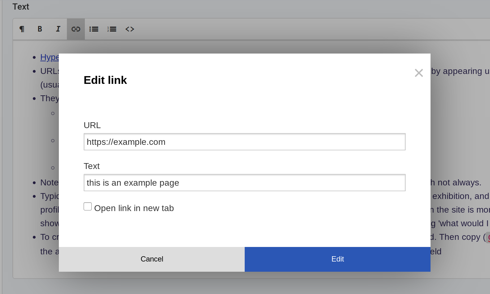
Insert link showing 'URL' and 'Text' fields
We need the ‘https://’ prefix in the URL, but not in the text. ‘www’ is often redundant too, though not always.
Typically for an episode, an artist may have their own website, or links to a gallery or particular exhibition (and perhaps some social media profiles too). Sometimes it’ll be best to link to their homepage; other times a specific page deeper within their site is more appropriate (for instance, showing the work that is the focus of discussion on the podcast). Use best judgement by thinking ‘what would I want to see as a visitor?’
To create a link, it’s best to load it in a separate tab or window to ensure it loads as intended. Then copy (CMD + C) the URL from the address bar (rather than typing it in manually) so that it can be pasted (CMD + V) into the URL field
Links to an email address are created in the same way. However, use ‘mailto:’ ahead of email address in the URL field. (URL = mailto:sarah@materiallyspeaking.com)
Lists
Unordered lists are styled automatically with bold em dashes (—) in place of standard bullet points:
Lists of things
Key points on a theme
Visual distinguishing
This secondary list is a list-within-a-list (created using the 'tab' key).
Numbered lists are styled automatically:
Sequence
Priority
Instructions
Names and titles
When an artist is first mentioned, spell out both their first and second name; thereafter use their first name alone (Norwegian artist Turid Gyllenhammar tells us how she finally came to carve marble in her 50s, and what challenges she had to overcome to get here … Turid explains how she…).
Avoid the use of titles such as Mr, Miss, Ms, Mrs, Sir, Lord, Lady and so on, unless the person is better known with it than without it (the Duke of Westminster).
A doctor or professor could use the prefix Dr or Prof (without full stop) where first mentioned (Dr Jenny Jones and Prof Kevin Keating…) but thereafter refer to them by name alone (…Jenny Jones and Kevin Keating agreed)
[see also Abbreviations]
Numbers
In text, one to ten are spelt out, from 11 upwards they appear as numerals.
That said, ideally a sentence would not start with 11 or more. (so not 1,000,000 people listened to the last Materially Speaking podcast). Though it breaks the rule, spelling is better (A million people listened to…). But best would be to find a form of words that avoids either starting the sentence with numerals or spelling out the greater-than-11 number (so here An estimated 1,000,000 people listened to…).
Numbers above 999 should include commas according to convention (1,000, 12,000, 340,789, 4,000,567, etc)
Ocean or sea
Use initial capital letters for both words (Pacific Ocean, North Sea)
Pictures
Good quality images are central. For visitors to the site (as well as social media) they can help illuminate the visual aspects of what they hear and read. However, quality is a subjective and nuanced term – both aesthetically and technically – and limited by what is available and what is required. Numerous factors should be considered.
Aspect ratio: The proportion of width to height expressed as 4:3, 16:9, etc. Landscape ratio images (wider than taller) tend to be set as 100% width of the content area (width 100%), while portrait images (taller than wider) tend to be set as 50% width from breakpoint 2 (BP2 width 50%).
Breakpoints: In responsive web design, you can choose to adapt the style of the site depending on the screen's dimensions. The code starts from a narrow / mobile point of view, and adds breakpoints (BP) at critical points as the screen width increases. These have been selected specifically for this site's design and content: BP1 > 560px, BP2 > 704px, BP3 > 960px. Content width can be set for each breakpoint by selecting options for the 'Width of block' field.
File size: the space the file consumes on a hard drive measured in KB or MB. Aim for less than 1.5MB files. Source images may be 5–10MB but can be processed using photo manipulation software such as Photoshop or Pixlr (free online web app) by reducing the resolution (not cropping necessarily) and saving at 80–90 per cent quality if a JPG / JPEG (identical file types).
File type (file extension): the web allows for JPG, PNG and GIF. Most images of real life produced by cameras end up as JPG. All other file types (TIFF, RAW, etc) are not acceptable.
File names: to ensure clarity and web suitability, the following conventions should be used:
each file name must be unique
include only: lower case letters, numbers, hyphens and underscores (often used to replace spaces)
exclude any: spaces, punctuation or symbols
if of an artist or their work, include their name at the beginning, the name of the piece, the year
end each file name with a number (typically -01). If another version of that file is required due to cropping or image adjustment, increment that number (ie -02).
Quality (technically): images should be free of compression artifacts.
Quality (aesthetically): composition, focus, lighting, contrast, colour, etc.
Resolution: the pixel dimensions of a file, typically as width × height (ie 2400 × 1800px). Aim for width 2400px and not less than 1200px though this depends on how the image is laid out on the page. Resolution can be decreased but never increased.
Technical implementation: images that are uploaded to the CMS and used on the site are automatically processed into a few different resolutions. When a website loads, the browser sees the list of available files and then selects the appropriate file to actually download based on the device's screen size and internet speed.
Thumbnails: each episode or blog post has an image chosen as its thumbnail to appear on the index pages (/episodes, /blog). These are cropped to a consistent ratio using the focal point which is either the centre or a chosen point of the image
Picture captions
Where a piece of work is shown – not a portrait – it should always include artist's name, title of piece (italicised), date made (if known), material used (if known), other detail/s (if applicable), full stop, 'Photo:' followed by photographer's name (Armen Agop, Untitled 107, 2010, black granite, private collection. Photo: Armen Agop). For instance, as here:
Armen Agop, Untitled 107, 2010, black granite, private collection. Photo: Armen Agop
Ideally, all photos include a picture caption – a short explanation of what is shown – unless it's self evident.
As far as possible, always try to credit the photographer.
A typical picture caption:
Turid Gyllenhammar with Ingeborg from her Nuova Vita series. Photo: Adele Gyllenhammar Raaum
Point of view and tone
As far as possible, Materially Speaking is written in the third person (Sarah aims to… rather than I aim to… and Turid's sculpture is…).
Adopt a clear, positive, informal/colloquial tone (she'll aim to… rather than she will aim to…).
Seek to convey conviviality (Here we listen to… rather than the more formal or distant Here you can listen to…)
[see also Tense]
Proper names
A specific person, place or thing is always begun with a capital letter whether at the start of a sentence or midway through it (Jay Schuerch's Little Bronze was one of the pieces recently on show at the Uffizi, Florence)
It is not Materially Speaking style to capitalise the whole of a proper name
Nor is it style here to add a different kind of emphasis by putting the proper name into lower case as this can confuse the reader
Punctuation
The ideal is to keep punctuation to a minimum but that its use should add sense, improve clarity and help avoid ambiguity
Quote marks
Single quotation marks form the main part of Materially Speaking's visual identity.
So, for all quotes, use single quotation marks ('My father was a craftsman who carved Renaissance musical instruments…').
Only use double quotation marks when a quote appears within a quote ('…he once told me "Sarah, making instruments is bliss". I'll always remember that').
Single quotation marks can also appear in 'air quote' circumstances (Jim Hager talks to us about … his ‘cardboard’ House of Cards carved from a single block of marble)
[see also Punctuation]
Ranged left
Typographic style throughout is for all text to be typeset aligning vertically on the left. (In the US this mode of typesetting is called flush left). This means a column of text will have a vertical left-hand edge and a ragged right-hand edge (as you see here) – which is why this mode of setting is sometimes referred to as 'ragged right'. The following typesetting options are verboten:
Ranged right text (that is, the opposite of ranged left) is a no-no. (In the US this mode of typesetting is called flush right). English text typeset this way is usually much harder to read. (Of course other languages such as Arabic, Hebrew and Persian are set up to read right to left).
Justified text, that is a column of text with both left-hand and right-hand edges being typeset to be vertical – achieved by means of variable letter and word spaces – is also not style.
Centred text, that is type that has been typeset to appear symmetrical around a central axis in the middle of the column is another no-no here
Spelling
Use standard English not American spelling (analyse not analyze, fulfil not fulfill, focused not focussed, etc). If in doubt, refer to the OED
Tense
As far as possible, use the present tense (In this episode we'll hear… rather than In this episode we heard…)
[see also Point of view and tone]
Time
Follow the convention of hour/s, colon, minutes with single hours preceded by a zero (02:12).
Use the 24-hour clock instead of am or pm (so 18:00 rather than 6.00pm or 6pm)
Typeface
The brand's typeface is Akzidenz-Grotesk and its web suitable counterpart Basic Commercial
Upper case and lower case
Upper case (or uppercase) refers to CAPITAL letters (or caps).
Lower case (or lowercase) refers to small, non-capitalised letters
[see also Capital letters].
War
Ideally, spell out (first world war) or (1914–18 war); similarly (second world war).
Note use of en dash, not hyphens, between dates.
In other circumstances, spell out (World War II not World War 2) and if appearing subsequently, abbreviate (WWII). [see also Abbreviations and Acronyms]
Also, refer to 'war/s' not 'War/s' (for instance the Iraq war not the Iraq War or The Iraq War)
Weights
The Materially Speaking website uses two 'weights' of the font Basic Commercial: roman and bold. Roman is one name for 'normal' text and is the default style used across the site for body copy.
Weights appear within text that is always set ranged left
[see also Typeface and Roman and Italic and Bold and Ranged left]
Word spacing
Single word spaces should be used throughout.
Delete any double word spaces between one sentence and the next.
Delete any double word spaces between abbreviations or acronyms
[see also Initials with surnames and Abbreviations and Acronyms]